
R.J. Leonard Foundation
Forging a new web presence for a non-profit with a great cause
May 2017 | Web Design, Content Strategy
Project Objective
Design new website to improve usability, storytelling and visual appeal.
The R.J. Leonard Foundation brought me on to help identify opportunities for growth in their current website and then design and implement a new, refreshed website. I learned a lot about auditing and design and used my design and branding talents to make the new website much more usable, visually appealing, and informational.
Strategy Meeting
Before breaking any ground on the project, I had to set some concrete goals.
I met with the Senior Director of the foundation, who would also be my point of contact, to identify the details of my work with them:
Goals: The client wanted a new website to showcase the work of the foundation and facilitate donations.
Budget: I would be doing this project pro bono due to my relative inexperience. I would be gaining valuable experience doing this project, so I was okay doing it for free.
Timeline: The client wanted the website fully redone and implemented by the beginning of April, 2017.
Vision: The new website would not differ much in content from the current site, but would be visually different. The client wanted the site to be more modern, organized, and easy to use.
Website Audit
First I assessed the current RJLF site.
I did an audit so I could fully understand the state of the current site.
I focused on:
Is the site easy to use?
What is the visual tone of the site?
What are the opportunities for growth?

Old version of the RJLF website
Navigating the current site at length, I identified the following areas of opportunity:
Navigation is a challenge, categories of information seem to be in disparate places
The story of the foundation is in text form, no visuals
The current page is dark and media is black and white, perhaps invoking the wrong message
What I learned from exercise:
There is an opportunity to make navigation and information architecture much more accessible
Visual style needs to change; made more bright and optimistic in use of color and media
Comparative/Competitive Analysis
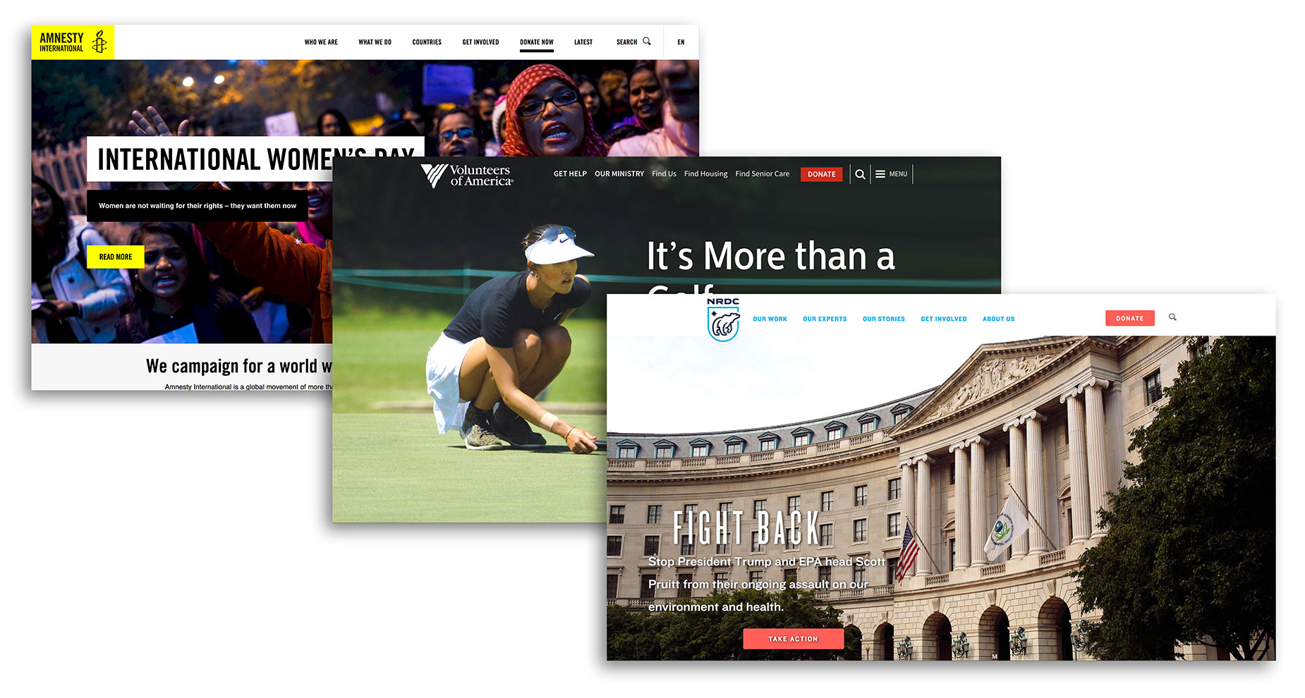
Moving on to the analysis portion of the project, I wanted to learn how some of the most well-known non-profit foundations told their stories to their audience. I did this by going to some well-known foundations and navigating their sites thoroughly.
Going into my assessment of these sites, I had the following goals:
Identify common design conventions and media elements being used by successful non-profit websites
Gain inspiration for visual design of site
Assess information architecture of established sites
Results of exercise:
From looking at websites like NRDC.org, VOA.org, and Amnesty.org, I identified some conventions that help improve non-profit websites:
Images are large, bringing the reader in and captivating them; the images tell the story
There are constant calls to action along the top navigation bar and throughout the site
There are clear messages communicated through the categories of "Who", "What" and "Why"
I would later use these insights to guide my design of the new website (see wireframes below).
Content Audit / Site Mapping
I mapped out the current RJLF site in order to:
Show challenges of current navigation and IA
Outline all information from current site to see what pages can be combined for easier access
I used Google Draw to create a simple site map:

This mapping shows:
There are too many clicks needed to access all the information on the site. Instead of each topic on separate pages, the information should be accessible on fewer pages.
There are many pages that can be combined to make the site easier to read.
The user is not presented with a "thesis" on the home page, which is a missed opportunity to give an overview of the whole site upon first visit.
New Sitemap / IA Strategy

My design of the new sitemap took into account:
Combining pages to lessen the amount of clicks needed to find information.
Start users with a thesis and summary and let them find more information if they so desire.
This mapping enables users to get the information they need faster and with fewer pages to navigate.
This step was essential to guide my design of the new site.
Wireframing / Layout Design
This new layout meets both client and user needs:
Navigation is simple, the information architecture is more organized under the categories of What, Who, and Why
Story of the foundation is told through graphics and media in an easy-to-discover format
Page follows modern convention, including full-width images and bright, optimistic visual language
Reduces the amount of clicks required to glean the important information from the site
Presents multiple calls to action on top of page and throughout the site
Implementation
Using the client's choice of content management system, Weebly, I created the website according to my wireframe designs. View the full website here!
Feedback
It’s rare that you come across a standout talent like Nathan. I’ve had the pleasure of working with Nathan over the past few months, during which I worked with him to completely redesign our charitable foundation’s web presence. Above all, I was impressed with Nathan’s ability to really listen intently to all of our concerns and to deliver outstanding work that incorporated great solutions to our challenges. He was consistently the advocate of the user of our website, making sure anyone visiting our site would be pleased with the experience. As part of a high-performing design team, Nathan earns my highest recommendation.
-Kathleen Kasper, Senior Director, RJ Leonard Foundation