I work in a retail store that is focused on bringing technology to the public. We focus on bringing customers a great experience, but oftentimes I feel as though I'm merely a translator between the engineers making the products and the common user, who mostly describe themselves as "bad with technology". It is my notion that in fact it's not the users that are "bad with technology", but rather that the technology is "bad with users".

Many people feel bad for being "bad with technology"
I know people who are "good with technology". Heck, I'm "good with technology", but what that tends to mean these days is that I am comfortable with the level of abstraction and fault with which modern technology operates. If I see a message that says "could not connect to server", I know that the device is having an issue with its internet connection. If I see a message saying "Unknown Error", I cringe, and then say to myself "maybe I'll try again later". I'm okay with interpreting these messages, but most people are not. The technology of today is designed by people who are "good with technology", and those people assume everyone else knows how to deal with computer technology. But I know that the common user does not.
Designers need to do better for users
UX design must be applied to technology of all kinds in order to make it easy for people using the technology. Take for example the error messages I was talking about before; most error messages seem to be completely incomprehensible, and for no reason.
As an example, let's take a look at some errors you might see when using a Mac. If you have tried to erase an iPad and there's some kind of error, a lot of times you'll see something like this:

A good error message should have the following elements:
A verbose description of what went wrong, in plain english
Instructions for what the user can do next to try and resolve it
This error, while having a "More Info" button, doesn't do the job of a good error message, mostly in the phrase "an unknown error occurred". To whom is it unknown? It's certainly unknown to the user, but what about the computer? Shouldn't it kinda know what error #14 is? Or at least Apple engineers, who designed the error codes, shouldn't they know what error #14 is? Is there a reason they aren't telling us what it is? Furthermore, there are no instructions for the user on what to do next. Even if it told us "Restart computer and try again", that would be better, but what I would prefer is the message "Restart computer, try again, and if the issue continues, contact Apple Support". That at least gives me a workable plan on what to do next! I, as a layman, now have a plan of action on how to address this problem.
For an example of a better (but still not great) error message, here's an error from the iTunes program about not being able to connect to the store:
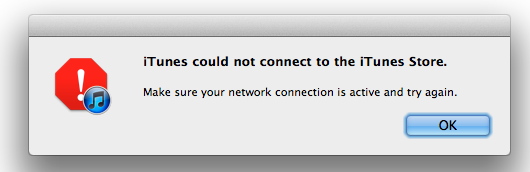
Now this is a better message, because it is telling us what happened and some next steps to try to solve the issue. It tells us to make sure the network connection is active and to try again. Okay, thanks for the action plan, but what if that phrase is too complex for a new user? What is the network connection? How is it active or inactive? If I were to rephrase this error, I'd say something like this:
"iTunes could not connect to the iTunes Store. Make sure your computer is connected to Wi-Fi and can access the internet and then try again"
Okay, it's still not great, and I suppose I can give credit to engineers who design the message, it's tough to put this stuff into plain English, but still, we need to design things to be accessible to the layman, we need to make clear error messages that give us a way to solve the issue.
We need to design for everyone
Error messages are only one aspect of the responsibility designers have to make technology accessible. In the next few weeks I'll keep discussing this topic, but for now I'll leave it with this thought: We should not hold users to some kind of standard of knowledge. We don't want the only people who are able to use our products to be the ones who claim they are "good with technology".
Technology has a huge opportunity to be much more accessible to everyone, including people who just picked up a computer today. Without making even just our error messages more verbose and transparent, we alienate and confuse the people who are using the device, and we discourage them from continuing to use it. This is where the power of UX design comes into play, in which our designers can find the best phrasing for an error, the most accessible manner of speaking to the layman. We can design to make people feel joy from their devices, and not confusion.
For more on this and other topics, continue checking in and feel free to read previous posts, and don't hesitate to drop me a line!